Smooch
Brand Development
Details
Smooch arrived as a founder-led concept for an intimacy soda, built to help people reconnect in a culture that makes almost no space for that. The product idea was strong. The category around it wasn't.
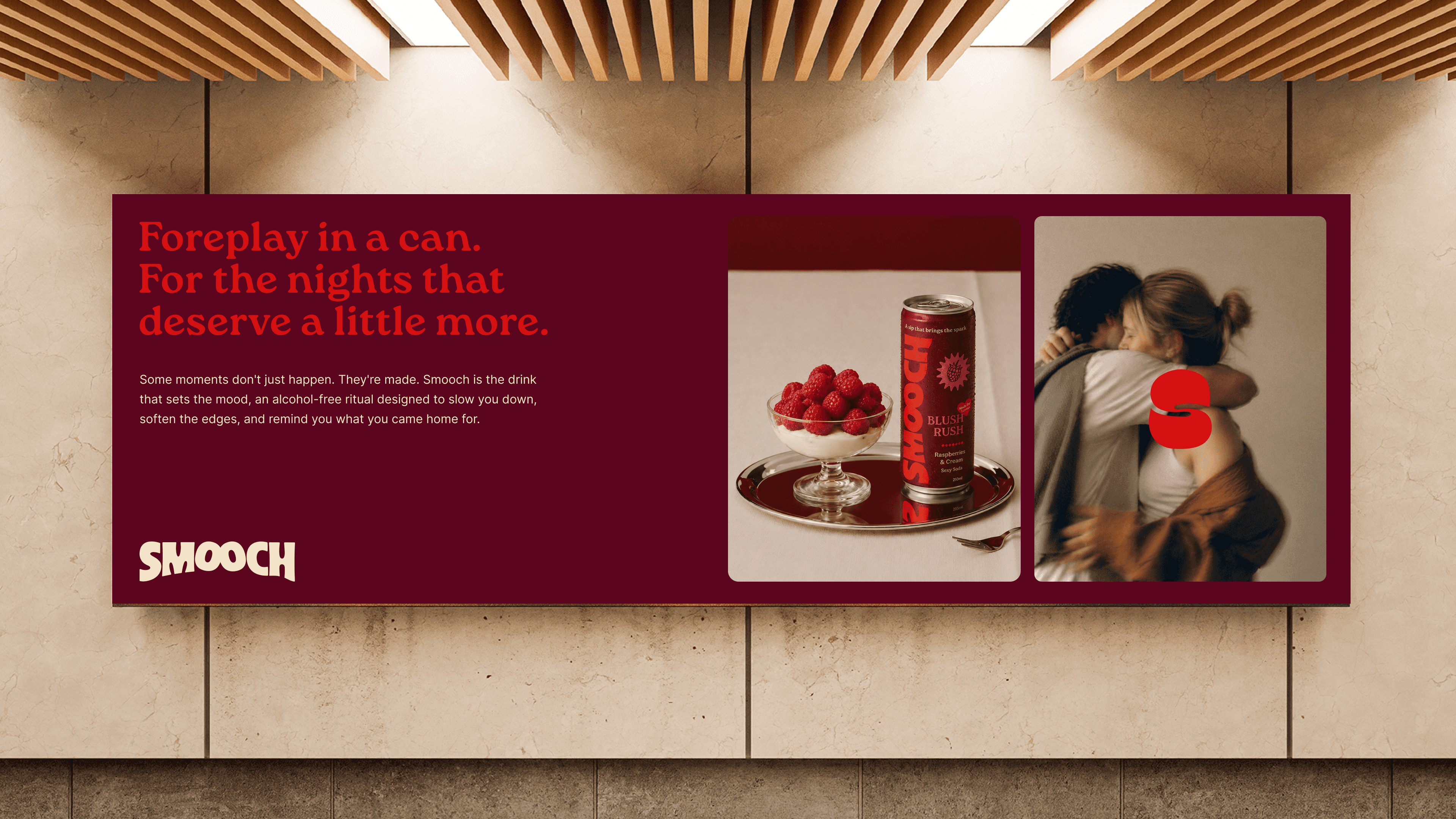
Sexual wellness mostly sits in two places. Clinical, treating desire as something to fix. Or overtly sexual, treating it as a joke. Neither felt right for what Rach was building, so we set out to define a third space between them, sophisticated enough to trust, playful enough to want.
Most functional drinks in this space lead with ingredients, what's inside, what it does. We took the opposite approach and built the strategy around what the ritual meant instead, an invitation to reconnect rather than a fix for something broken.
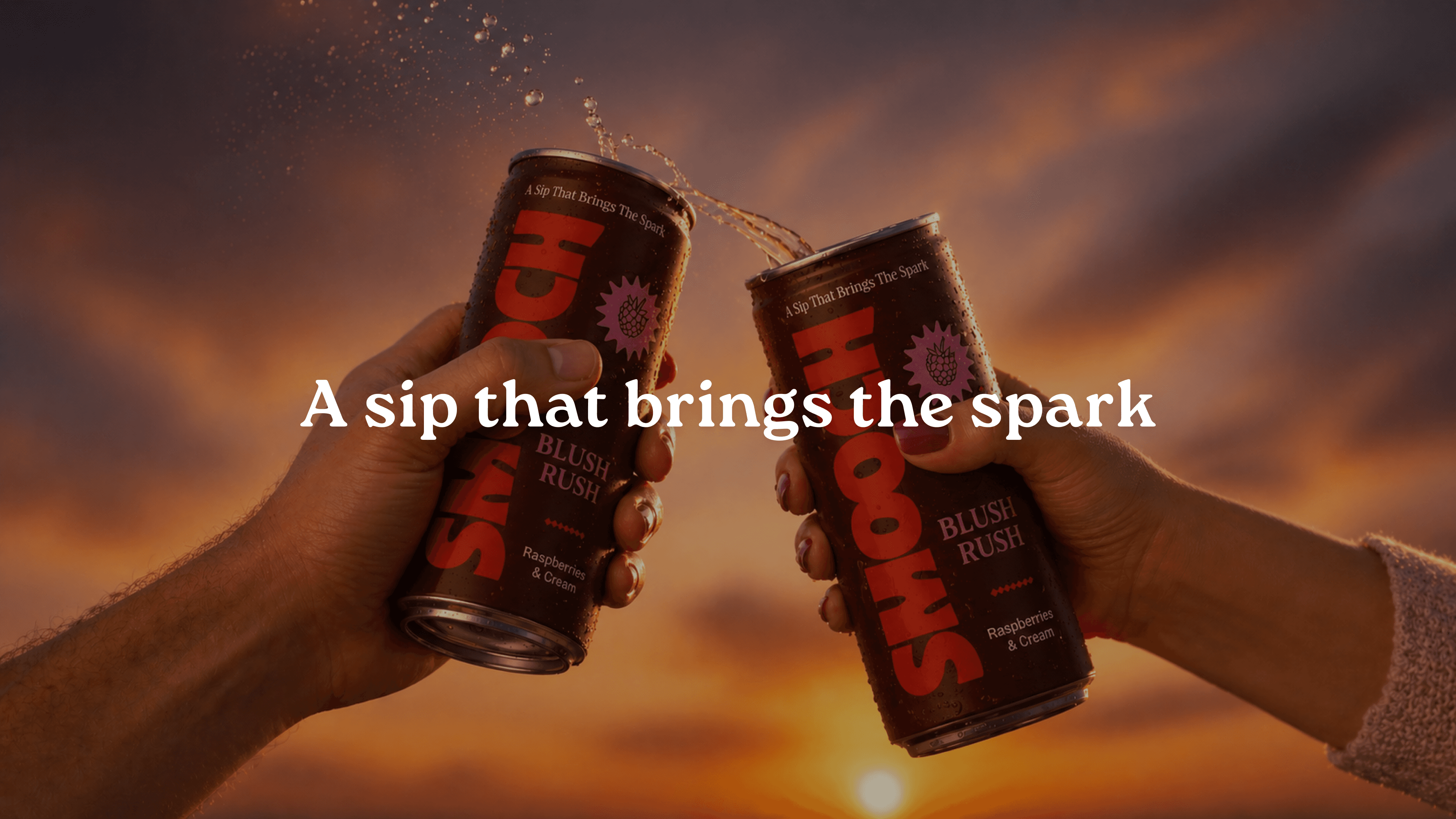
That decision shaped everything that followed, from the deep mulberry and electric red palette to flavour names like Blush Rush and Peach Cheeks. The wordmark carries the same thinking. The two Os in Smooch became two faces leaning in, kissing inside the letters, so the idea of connection sits inside the name itself.
Built for the fridge, the shelf, and the boardroom equally.
Services
Brand Development
Graphic Design


Credits
Brand Partner
Jackson Tate